Sapporo City Branding
2023, BrandingThis university project was created in my last year at LISAA Paris École de Graphisme with my fellow students Hannah Ni and Cybèle Dumont. This project aimed to create a new identity for a city of our choosing, keeping in mind both contemporary and local design elements.
We approached this project intending to create a playful and colourful new identity for the city
of Sapporo. Using colourful elements and playing with geometric shapes we developed an identity that suited more contemporary styles while keeping in touch with Japanese design aesthetics.
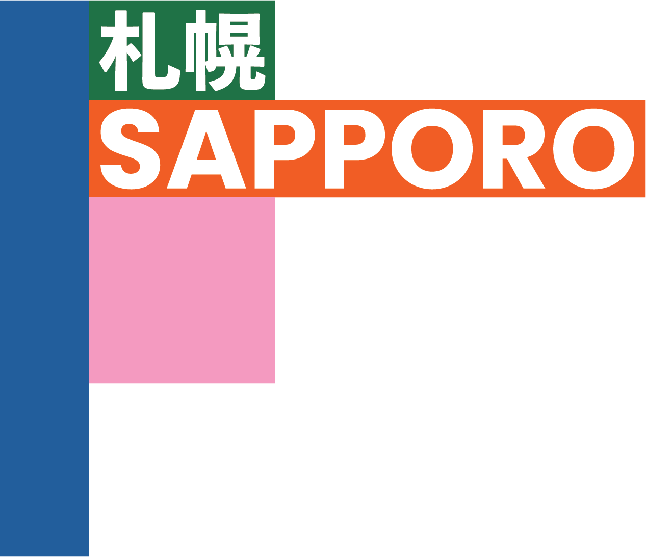

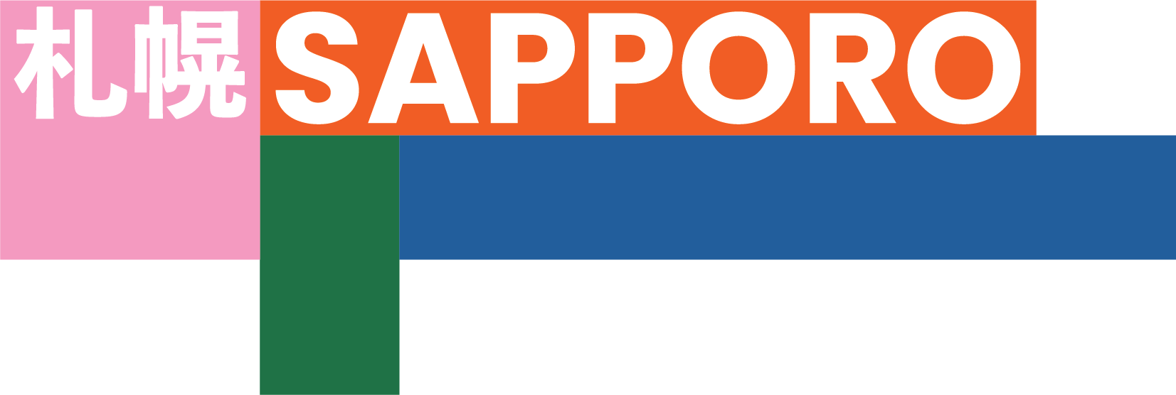
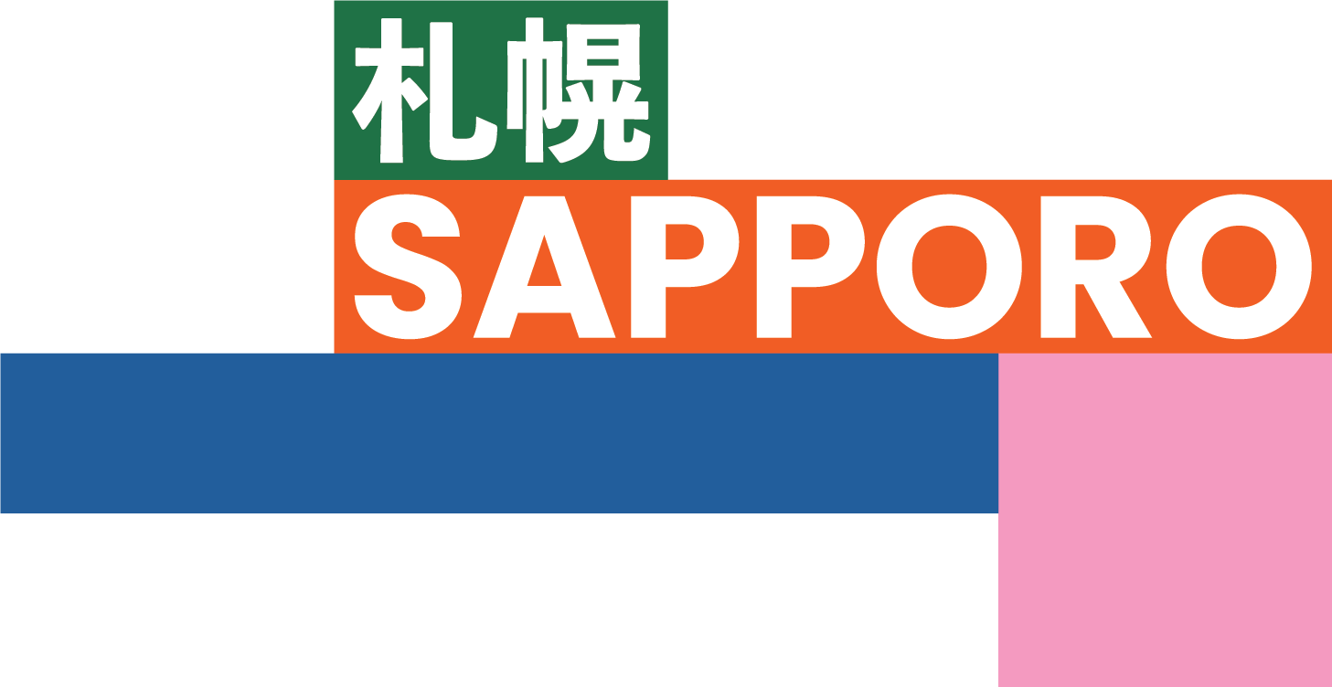


For the logo creation, I wanted to create a logo that could be changed and altered based on its application. When we started with this project we chose a simple colour scheme and to apply this
to the logo I created shapes which fit the logotype both in English and Japanese whose orientation could be changed to create different logos.
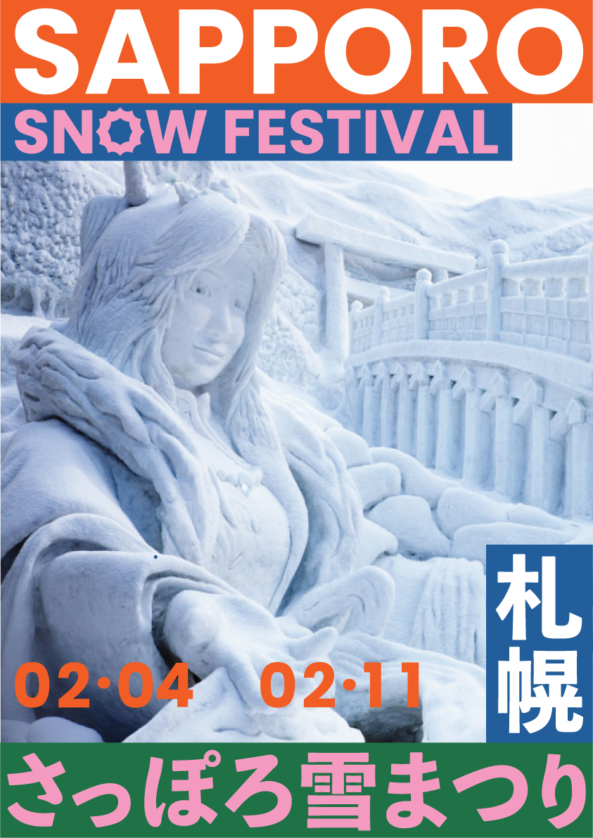
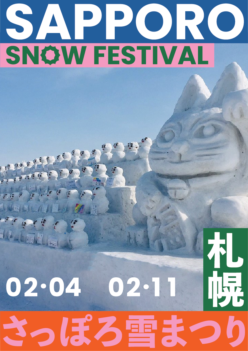
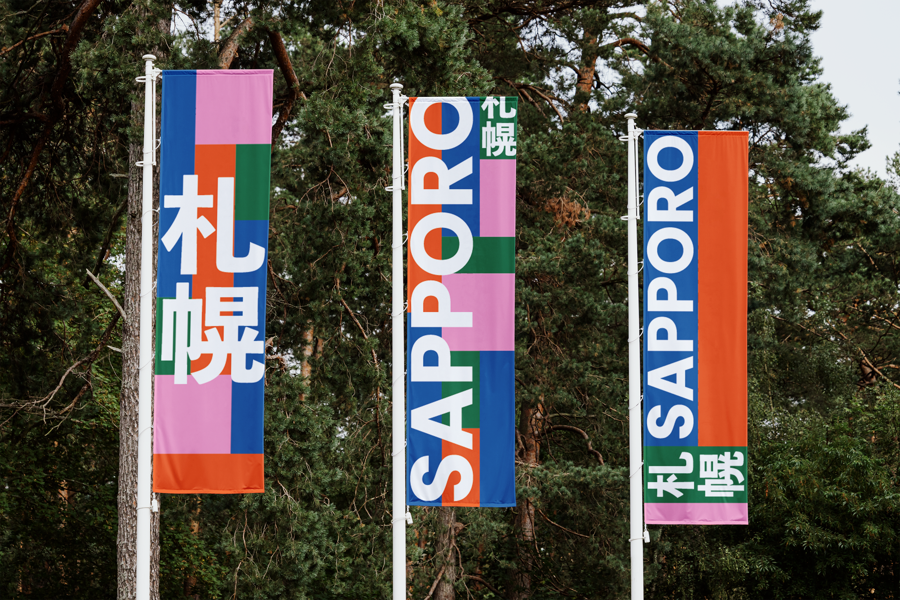
We used these basic shapes and then applied this formatting to create a set of posters for the Sapporo snow festival as well as applying this look to objects such as flags and banners which
the city could use.